Video: Measuring and Simplifying Complexity in Data Visualizations
S. Himmelstein | October 23, 2018When inspecting information visualizations under time-critical settings, such as emergency response or monitoring the heart rate in a surgery room, the user only has a small amount of time to examine the visualization “at a glance.” Data complexity can complicate decision-making and when timing is critical, it is essential that a chart be easy to read and interpret.
Computer engineers at Columbia University and Tufts University have developed a new method that measures the complexity of a data visualization and can be used to develop easier to read visualizations. The open source Pixel Approximate Entropy (PAE) system provides a visual complexity score that can automatically identify difficult charts. The researchers modified a low dimensional entropy measure to operate online charts and conducted user studies that demonstrated the measure could predict how well users perceived charts. Increased chart PAE was shown to correlate with reduced judgment accuracy.
The approach is expected to be of value to data scientists and engineers who are developing AI-driven data science systems. By providing a method that allows the system to better understand the visualizations it is displaying, PAE will help to drive the development of more intelligent data science systems.
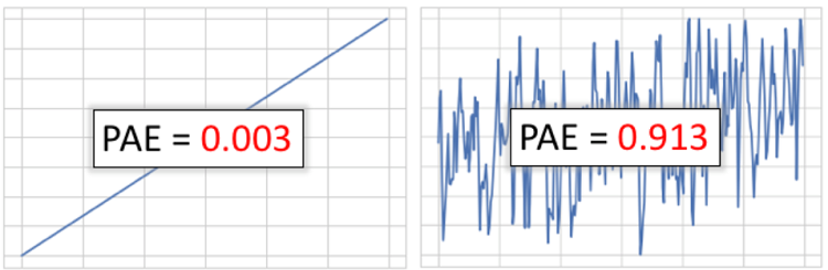 The chart on the left is intuitively simpler and easier to read. PAE can be used to determine this analytically: the first chart has a PAE of 0.003, while the second chart has a PAE of 0.913. Source: Columbia University