Dutch Designer Creates Font for Dyslexic Readers
Jonathan Fuller | December 05, 2017A Dutch group has developed Dyslexie font, a typeface designed to make reading easier for people suffering from dyslexia.
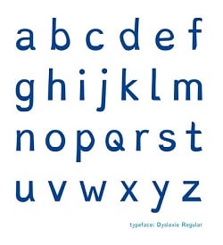 An example of Dyslexie font letters. Source: Christian BoerIndividuals with dyslexia have trouble reading despite normal intelligence. The disorder is estimated to affect up to 7 percent of the global population, although other estimates have been as low as 5 percent and as high as 17 percent. Typical errors associated with dyslexia include swapping, mirroring, turning or melting letters together, all of which impair reading.
Dyslexie font incorporates unique features to prevent these errors:
- Giving some letters a heavy bottom prevents readers from turning them upside down
- Letters like ‘b’ and ‘d’ are inclined
- The openings of letters like ‘a’ and ‘c’ are enlarged for easy recognition
- Letters like ‘f’ and ‘p’ have longer sticks
- Punctuation marks and capital letters are bolded
- Spacing between letters is enlarged
Dyslexie font was created by graphic designer Christian Boer as a graduation project at the Hogeschool van de Kunsten. Boer’s own dyslexia served as an inspiration for the project. Dyslexie font’s website offers font files, a text editor, Google Chrome extension and web plugin for purchase.


Very interesting idea, to adjust the font. Good article, thanks!