Diagram depicts US energy flows in 2018
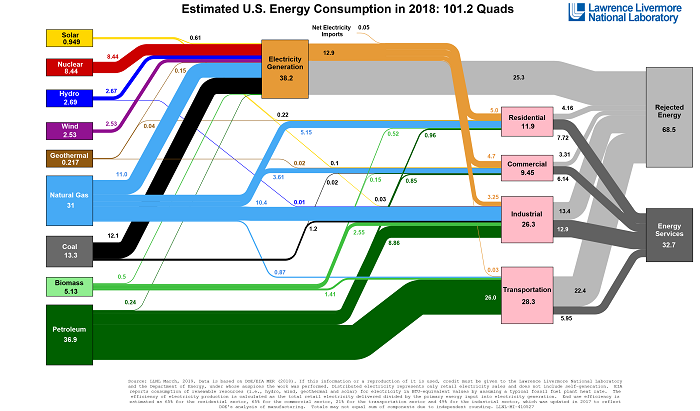
S. Himmelstein | January 27, 2020U.S. Lawrence Livermore National Laboratory (LLNL) has developed an energy flow chart for the U.S. in 2018, showing that the nation consumed an estimated 101.2 quads of energy that year.
The Sankey diagram documents consumption of solar, geothermal, nuclear, hydrothermal, biomass, natural gas, wind, coal and petroleum for 2018. Energy usage is totaled for major consuming sectors, and the contributions of imported and domestically generated electric power to the annual total is indicated.
LLNL produced the first diagrams illustrating U.S, national commodity use in the mid-1970s. In addition to the national energy flow chart, the agency has also published charts depicting carbon (or carbon dioxide potential) flow and water flow at the national level as well as energy, carbon and water flows at the international, state, municipal and organizational level. These Sankey diagrams help analysts and other decision makers to visualize the complex interrelationships involved in managing national resources.
 Source: LLNL